Monday, February 7, 2011

"Speed Trials" hosted by Tim May

Visual Thinking School

This VTS centers on the subject of quickly rendering concepts with sketching techniques.


Date:
Thursd
ay, February 3, 2011

Run by: Tim May
Notes by: Graham Barey

Attendees: Public

Libations: Plentiful (although Graham broke two beers preparing the snacks)

Ingredients

: white paper, markers

Agenda:

Icebreaker

Drill #1: Emotion

Drill #2: Objects

Drill #3: Tech

Drill #4: Biz

Palette Cleanser

Define Project

Execute Project

Assess


4:00 pm – Intro/Goals


4:15 pm – Drill #1: Emotions

Attendees were asked to sketch a number of emotions on large sheets of white paper, with approximately 20 seconds devoted to each sketch. Emphasis was placed on speed and initial thought capture rather than refinement of art. Emotions sketched: Love, hate, envy, rage, excitement, shock, depression, fright, empathy, regret, conviction and “bromance”. After the sketching was finished, everyone was asked to circle the room and view the other guests’ sketches.


4:25 pm – Drill #2: Objects

The second drill had a similar progression to the first. The objects sketched included: A car, a chair, a desk, a tree, a fish, bread, a clock, a factory, a shop, an office building, a road, a helicopter and a dinosaur. After the sketching was finished, everyone was asked to circle the room and view the other guests’ sketches.


4:35 pm – Drill #3: Tech

The third drill had a similar progression to the first two. Tech items sketched: Middleware, cloud computing, network, server, laptop, hub, a “launch” (of software, a product, etc.), IP, software, application, platform, wireless and dashboard. After the sketching was finished, everyone was asked to circle the room and view the other guests’ sketches.


4:45 pm – Drill #4: Biz

The final drill had a similar progression to the first three. The topics sketched were: organization, ROI, synergy, deploy, strategy, optimize, customers and HR.

4:55 pm – Palette Cleanser
After the final drill was completed and evaluated, guests were asked to sketch science fiction topics. These included: robot, alien, universe, laser, space station, planet, solar system, space woman, space food, asteroid, spaceship

5:05 pm – Define Project

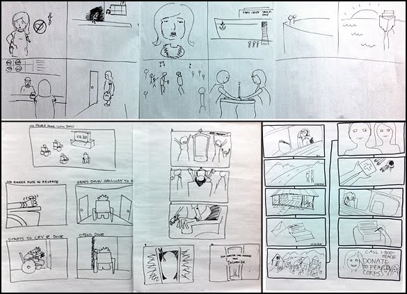
Tim attempted to define the project but Graham could not locate his notes. Tim then viciously beat Graham and made him cry. Following that, Tim found the notes himself and proceeded to explain the purpose of the project. Attendees were asked to sketch a process using the visual techniques they had just practiced, that process being the one of buying a house. The group broke into smaller groups of about five members each and proceeded to discuss and sketch the steps of their process.


5:13 pm – Execute Project

The teams brainstormed, sketched and ultimately compiled their concepts into posters that communicated the property buying experience.


5:35 pm – Assess

The teams assembled after their projects were completed and presented to the group.


5:45 pm – Plus/Delta

Tuesday, November 2, 2010

Invent it, XPLANE it - by Tim May

This public VTS gave participants the opportunity to brainstorm, design and create visualizations for practical yet-to-be invented products.

Twenty eight people were in attendance on a beautiful Thursday evening in the Portland Studio.


The stated goal initially was to brainstorm a list of ideas for products that solved a need, and eventually create a blueprint xplanation for the product (examples of blueprints were handed out).

We put a few criteria around the product:
  • It had to be something that could be built today
  • Had to retail between $35.88 and $120.94
  • Had to solve an actual, real-world need
Some of the initial ideas included:
  • A solar powered cap with a rotating bill (to block the sun).
  • Electric sneaker cleaner
  • A charging bowl for personal electronics
  • Battery-operated windshield wipers for spectacles
  • Zipper-based transformer boots (long/short)
  • A self-cleaning refrigerator robot device
  • A plethora of others

We then affinity-mapped the ideas and held a quick vote on those we wanted to further explore.

The VTS then engaged in a basic Who/Do exercise, discussing who our target audience was for this product, and what we wanted them to do with it or how we wanted them to use it.

We at that point broke into smaller groups. The teams went out and held their own who/do to determine audiences and what the product's benefits might be.


We then presented the results of the Who/Do exercise.


The teams then went and put together their blueprints around their chosen ideas.

  • The Pie Enthusiast™ - a multi-sliced pie-cutter


  • Freeskins™ - peel away coating/paint jobs for your car


  • Steam-Puff™ - a human-shaped quick-iron/steam device.


  • The BRALL™ - brush your teeth on the go.


  • CNFDS - Feeding system to keep dog from eating cat food.


  • Be Dry™ A clothes rewarming system for bike-commuters.


Feedback was widely positive - some making comments about having a bit more structure - perhaps the most actionable suggestion was a request for some kind of take-away from the class.

Friday, September 17, 2010

VTS: Data Visualization

Visual Thinking School
What is data visualization?

Date: Thursday, September 16, 2010
Run by: Matt Adams
Notes by: Ryan Smythe

Attendees: Employees, Offspring

Libations: Plentiful

Ingredients: groovy music, TED, audio speakers, whiteboard, note cards, markers, 11x17 inch paper

Agenda:
Icebreaker
What is Data Visualization?
Main Stream Styles
David McCandless
Exercise
Plus/Delta

4:00 pm - Welcome
Matt welcomed everyone to this internal VTS, especially our Dachis Group guest Kate Niederhoffer.

4:05 pm - Ice Breaker
The ice breaker involved each person writing their name on one side of a note card and sketching a pie chart on the other side to represent how they spend their time on any given day.

4:30 pm – What is Data Visualization?
Matt used Wikipedia to define data visualization. He noted that demand is growing for the field.
Examples of mainstream styles were provided:
  • Line charts
  • Pie charts
  • Column chart (vertical)
  • Bar chart (horizontal)
  • Area chart

Matt spoke briefly about David McCandlessand then shared a TED video of David speaking about data visualization. Various opinions where shared in response to the video. Matt then promoted his book the Visual Miscellaneum by sharing select pages. He also critiqued XPLANE’s work in comparison to the McCandless examples provided.

5:30 pm – Exercise: How I Came to XPLANE
Make an 11 X 17 information graphic on the topic “How I came to XPLANE”. You have 30 minutes!

Everyone had a very different approach, especially Kerwin!

photos

6:15 pm - Plus/Delta
Feedback

Pluses
TED video ++
David’s accent +
David’s book +
Dialogue ++++
topic
exercise +
ice breaker
Kerwin present!
Kate present!

Deltas
Ryan has to clean up
lack of other examples
poor time management +
cut out pie charts and Wikipedia
more time for exercises +
even more exercises

Thursday, August 5, 2010

VTS: Rhythm and Design


Visual Thinking School
Rhythm and Design, exploring the synchronicity of music structure and visual design.

Date:
Thursday, August 5, 2010
Run by: Graham Barey
Notes by: Graham Barey

Attendees: Many

Libations: Plentiful

Ingredients: YouTube, audio speakers, whiteboard, chart paper, markers, transparencies, about a hundred envelopes, scissors, photos, love

Agenda:

4:00 pm - Welcome
Soon after four o'clock the Ant room was crowded with attendees for VTS. As this was my first public-facing session I was a little nervous. Even though I had done hours of preparation and public speaking is nothing new to me, it was a different experience as these people were here to learn something. Scary. Once the people were settled we began with a welcome and a brief introduction to the topic.

4:10 pm - Ice Breaker

The ice breaker I thought of involved each person sketching their name on one side of a note card and their favorite band or musician on the reverse side. This proved to be a little more difficult and limiting in terms of creativity than I intended. Still, the desired effect was achieved and we moved into a more detailed description of the topic.

4:30 pm - Background Information and Exercise One
Before the first pens hit paper participants were given some background on how popular music is organized structurally and how that structure applies to visual design. This introductory information should probably have been more robust (as was mentioned later in plus/delta) as many of the people in the room didn't have experience with making music. My interest in keeping the background information short was to get people moving quickly and not spend much time talking, which, as anyone who knows me will tell you, is something I am prone to do. After this brief lesson in music structure participants were asked to draw their interpretation of how 4/4 rhythm would be represented visually on a simple grid. Most people came up with similar renderings and, in retrospect, this exercise was probably extraneous.

5:00 pm - Listening and Exercise 2
Next the group listened to a selection of Rakim's song "When I Be On Da Mic" to begin to grasp 16/8 verse/chorus song structure. Next, color transparencies were distributed to give the group an opportunity to arrange compositions constructed from them which would be informed by the music structure we had just listened to. This exercise proved more effective than the first one. Compositions were meant to emphasize the 2-to-1 structure of popular music.

5:30 pm - Listening and Exercise 3
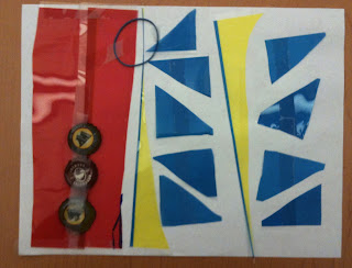
The final exercise of the night was to reinforce a new concept, that of surprise. In a rhythmic composition whether musical or visual an element that stands apart from the repetition helps to attract attention and add interest. To this end and as example we listened to "Come On Feet" by Quasimoto. A set of photos and letter forms were distributed to the group to use to make a new image which would reflect all the concepts they had learned to that point. Below the fruit of this exercise is shown.

6:00 pm - Plus/Delta
The goal of the night was to introduce participants to the rudiments of music structure and show how and why they apply to the medium of graphic design. This goal was achieved but could have been added to with a more effective instructional base at the outset. In the end, everyone had a good time and learned a little bit so even though there were bumps in the process the VTS was a success.


Thursday, July 1, 2010

VTS: Adding Music to the Visual

Visual Thinking School
Adding Music to the Visual—Exploring the Powerful Role Music Plays in Visual Storytelling

Date:
Thursday, July 15, 2010
Run by: Tyson Mangelsdorf
Notes by: Tyson Mangelsdorf

Attendees: Matt Adams, Deanna Rizzo, Stephanie Swain, Ryan Smythe, Teija Springman, Eve Curry, Charyl Looper, Marvin Gaviola, Tyson Mangelsdorf

Libations: Drop Top Amber, Full Sail Amber, Miller Genuine Draft (in the tall can)

Ingredients: Keynote, YouTube, iTunes, audio speakers, whiteboard, chart paper, markers

Agenda:

4:00 pm - Welcome
We all settled in the Ant room. As drinks and snacks casually trailed from the center of the large meeting table into the warm, dark digestive tracts of each attendee, light chatter and ambient background music filled the room. I purposely cut the music, and the chatter halted. All was quiet. Everyone's attention was on the music-killer.

I smiled and appealed, "Music has a powerful grasp on us, doesn't it?" Everyone agreed. It had added quite a blanket of ambience to the room, but we had all taken it for granted until it was stripped away.

From here, I welcomed everybody, introduced our subject, and went into the ice breaker.

4:10 pm - Ice Breaker
Everyone had to write down their name and a song that carried emotional resonance for them—a song, that everytime they heard it

4:20 pm - An Exploration of the

Emotional Power of Music

We started by watching a video about the ways sound affects us.

From the video, we came away with 4 golden rules about adding sound to any narrative.

4:30 pm - Excercise One
Music sticks with us, particularly when it's linked to a narrative. To prove the point, we went right into a quick, fun excercise where I played three movie score tracks and everyone could pitch guesses to which movie they were from. They were all guessed within a few tries, except the last one took more to identify exactly which space-movie it went with.

The tracks were:

  1. Back to the Future
  2. Misirlou (Pulp Fiction)
  3. I am a Man of Constant Sorrow (O Brother Where Art Thou)
  4. Star Trek II-The Wrath of Khan

4:30 pm - Sampling Animation with Music
Changing the soundtrack behind an animation really affects our perception of the visual story. We viewed an animation and changed the music track behind it as we rewatched the same scene. The music style ranged from classical, to jazz, to electronic, to modern alternative. Everyone in the room described the significantly different interpretation of the scene due to the change in music. It was amazing. After the first animation, we viewed another sample and performed the same review.

The animations we reviewed are here:

  1. BLU
  2. Anchored

5:00 pm - Exercise Two
Listen to a song that continuously loops for 20 minutes and draw on big paper what it emotionally conveys and what imagery comes to mind. We listened to Moby's song Rushing.

5:20 pm - Exercise Three
Everyone got in groups of three or four and had to choose one of their beloved songs from the ice breaker to storyboard an animation promoting a product or service. It could be fictitious or real, but they had to use the song as the backing track. The song must propel their concept into greater meaning.

The songs chosen were:

  1. I Wanna Dance With Somebody (Whitney Houston)
  2. Here I Go Again (Whitesnake)
  3. Rowing Song (Patty Griffin)

5:55 pm - Plus/Delta
Overwhelming, everybody enjoyed the VTS and had insightful, constructive feedback.

Saturday, April 10, 2010

Design the perfect _______.


Topic:
Design the perfect _______.
Date: April 1, 2010
Run by: Matt Adams
Notes by: Matt Adams

Attendees: Mike Beaulieu, Andrew McDonald, Nitya Wakhlu, Robert Schroeder, Ben Cerezo, Joel Ryan Brandon, David Vanadia, John Kurz, Debbie Zetik-Kurz, Brooke IllaHuston, Jodi Sweetman, Teija Springman, Chris King, Graham Barey, Tim May, Kerwin Carmbot, Charyl Looper, Matt Adams

Libations: Drop Top Amber, Full Sail Amber

Ingredients: YouTube, whiteboards, chart markers, chart paper, 3x5 notecards, Postits

Agenda:

4:00 - Introduction
After attendees gathered and took their seats in the Ant room, we welcomed everyone and gave a brief background to the history and culture of Visual Thinking School at XPLANE.

4:05 - Drawing Lesson
Everyone can draw. I gave a slightly different twist on the drawing lesson today, explaining Dave Gray’s, “Visual Alphabet.”


4:10 - Icebreaker
Everyone folded a notecard in half and wrote their name on one side. On the other side, people drew either their most favorite invention ever, or a great invention that they have created.


4:20 - Movie Time!
Out came th popcorn and we watched a couple inspirational clips. First, we watched then discussed the Nightline DeepDive from 1999, “One Company’s secret weapon for Innovation”
| The YouTube Video


We then watched Dave Gray’s introduction to his new book, Knowledge Games (retitled, Gamestorming), where he speaks about how he set the priorities, or success metrics for the book. Time Code: 00:00 to 06:14
| The video | The book


4:30 - Brainstorm Post-up
People filled three post-its each with ideas or products they thought were in desperate need of redesign. Once everyone presented and affinity-mapped their notes on the wall, we all dot-voted for the best ideas. The top five ideas were:
  1. Clamshell display packaging
  2. Flossing your teeth
  3. Wire mayhem created by too many electric devices
  4. Airport security lines
  5. How cats destroy your stuff

4:40 - Breakout - Group Exercises
People split into five groups of three or four members then the groups headed to corners of the studio and were directed to:
  1. Select the top success criteria for their redesigns
  2. Design and draw their solutions in 20 minutes


5:20 - Regroup - Presentations
Everyone brought their newly drawn works and gathered again in the Ant room were each group took turns presenting their work.


5:45 - + / △


Friday, February 12, 2010

Vino Thinking School: Wine Tasting

Hosted by: Kerwin and Marvin

We combined VTS Thursdays with Wine Fridays and got a very tasty visual session.

Our objective was simple: Learn a little about wine and what types of wines we enjoy. There were some surprises and there was consensus.

We had three bottles of wine; we covered the labels and numbered them. The wines were varieties that we've had before for Wine Fridays. In fact, they were favorites of many Wine Friday participants. We also had simple foods and water to help cleanse the palette after each sip.

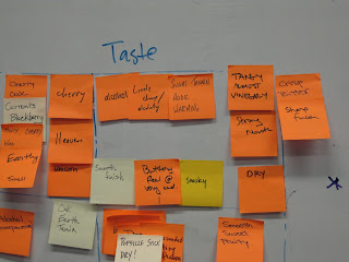
Participants were tasked to pour a little splash of wine into their glass. They swirled the glass of wine to bring out the aroma. They were asked to write down what they smelled. Once complete, they tasted the wine and were asked what they tasted. They did this for all three bottles. Below are the descriptive words people used for the smell and the taste.


Bottle 1:
Smell—Burgundy, oak, needs to breathe, bitter, cherry, currants, musty, earthy heaven, unicorn;
Taste—Alcoholly, little cheap, slight tanning, acidic, tangy almost vinegary, crisp, bitter, strong, dry, buttery, smooth, smoky.


Bottle 2:
Smell—Oak, perfume, earth, tannin, berrie, fruity/floral, mildew, balanced, alcohol;
Taste—Popsicle stick dry, well rounded, bursting with flavors, bitter, sharp, no mouth, quick, smooth, heat, flat.


Bottle 3:
Smell—Fruitata, gravy, warmth, pepper, lite oak, vanilla, raspberry;
Taste—No mouth, flat, thin, lite, crisp, interesting finish, smoother, mild, seafoody, nothing there, dead, thin, less than expected, fruit

Once the descriptions were posted. We heard professional reviews of each wine; without knowing what review matched to what wine, using our new knowledge, we assigned what review to a particular wine. As a whole, we were very accurate in both assigning the professional reviews to the wine and describing the wines flavor and aroma.

One surprise was Shaun's previous favorite wine was her least favorite of the three bottles. In fact, she raved about it in a previous Wine Friday and had a distaste for it during the taste test. Hmm.

Participants included: Shaun, Matt, Chris, Parker, Marc, Joy, Teija, Rich.

What was learnt: It certainly made us appreciate the complex flavors of wine a little more. It also helped individuals hone in on what they liked about particular wines.